Table of contents:
- What is a landing page?
- Two kinds of conversions and landing pages
- The attention span of a goldfish
- What does an effective landing page need?
- The main competitive advantage
- In the main heading
- In the subheading
- In the closing argument
- A striking hero image
- Strong benefits of the offer
- Reviews from happy customers
- A call to action that convinces
- The main competitive advantage
- What else to watch out for?
- Summary
A landing page is one of the important tools of digital marketing. It has the unique power to lead a user, through a standalone single-page page, to clicking the ‘Buy’ button or another call to action.
What is a landing page?
The very name landing page suggests that it is a special web page on which we ‘land’. From where? From an ad, email marketing, a social media campaign, or another external page.
Unlike a homepage, a landing page is built with one single purpose: to lead the visitor to perform one specific action.
What kind of action, or conversion, is that?
Two kinds of conversions and landing pages
- Click through landing page: with this kind of landing page, we want the reader to press a button and perform a specific action. For example, download an app, buy a product, sign up for a conference, etc.
- Lead generation landing page: with this kind of landing page, we want the reader to hand over a contact detail in exchange for added value. For example, for a free book or a webinar.
The attention span of a goldfish
A landing page therefore has the function of informing about what the reader will get with a conversion on the page. And the task of convincing them to do so. But convincing the reader to convert is not an easy task.
As you know, when we browse the internet, we have almost the attention span of a goldfish. According to research, many a page holds a user for only 8 seconds, which is the time of our continuous attention. We start reading an article, in the meantime a reminder beeps and someone calls us, and we have already closed the page with the article.
A user we may have lost forever.
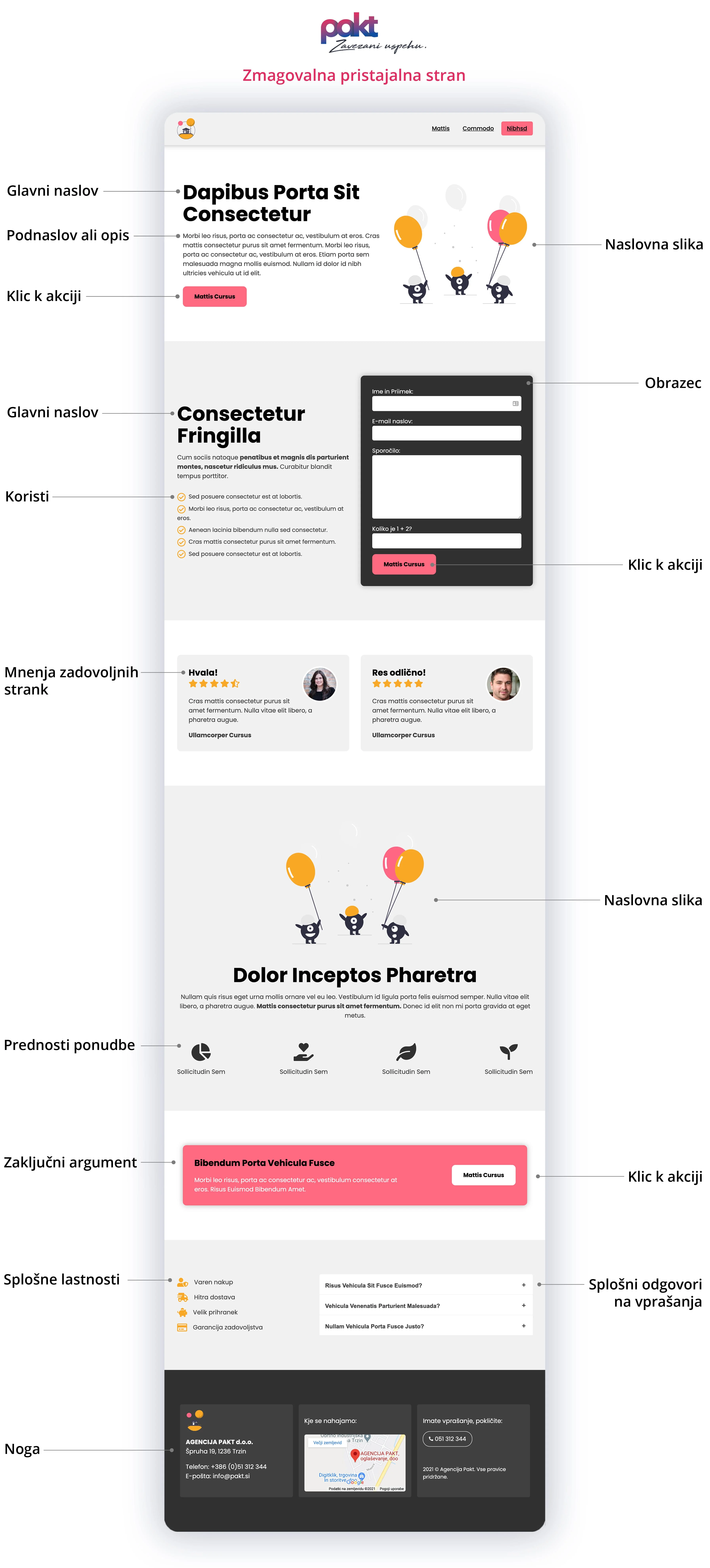
Here is an example of a good landing page:
What does an effective landing page need?
1. The main competitive advantage
What is it that makes you different from the competition?
On a landing page, we mustn’t waste time. When the user lands on it, the main advantages of the offer should be clear IMMEDIATELY.
The main competitive advantage sets clear expectations for buyers and explains why we are the company that will meet them. Where should the main competitive advantage be highlighted?
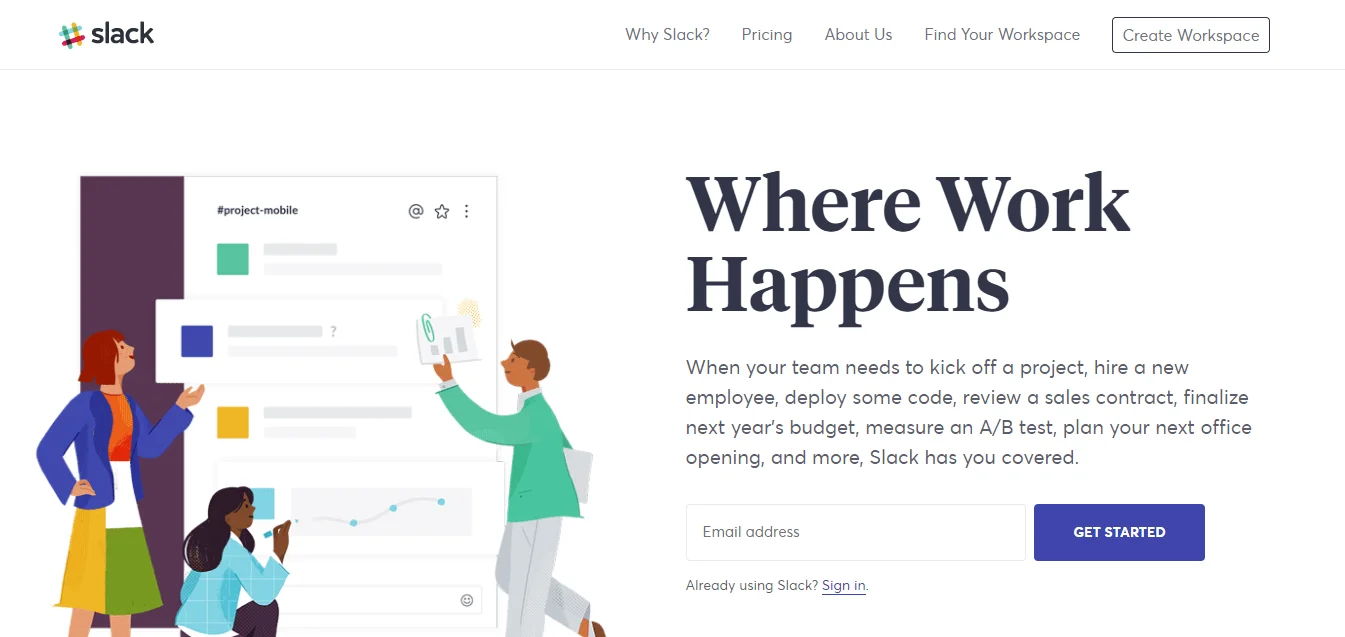
In the main heading
Let the heading be short, punchy, and above all clear. Let it convey the essence of the offer and let it touch on the user’s problem.
Example: ‘Where work happens’, a line from the landing page of Slack, the app for connecting colleagues.
Source: Slack
In the subheading
You can use the subheading to add information you couldn’t communicate with the heading. Either by having the subheading complete the heading. Or by having the subheading, as a standalone sentence, add additional information to the heading.
In the closing argument
We also highlight the main competitive advantage at the end of the landing page, and so give the user the reassurance once more that they will get what we promise. That way they will more easily click the button and complete a conversion.
2. A striking hero image
Sometimes the visuals on a landing page are even more important than the text.
Use a strong image, video, or animation that will grab attention. With the hero image and other graphic elements, work on the user’s emotions. Let the image let them know what awaits ‘on the other side of the offer’.
An image can say more than a thousand words, and a strong image combined with relevant text tells a story, and stories sell.
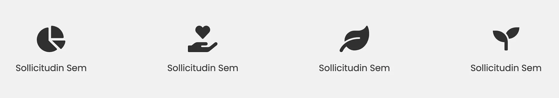
3. Strong benefits of the offer
Describe the value the offer brings.
Once the headings and graphic elements have convinced the reader, it’s the turn of additional information, with the benefits and advantages of the offer. You communicate them in a way that answers all the user’s additional questions.
Do this in a short and clear way. It can be in the form of lists or nice graphic elements with a short explanation.
4. Reviews from happy customers
When we see someone who has already made the leap successfully, we find it easier to do the same.
Research shows that the average customer reads more than 10 reviews before they trust a brand or an offer. With the help of evidence that speaks in favour of trust in the brand or the offer, the user finds it much easier to decide on a conversion.
Let’s add to the landing page:
- Customer reviews
- The number of customers we have already had
- Awards from trusted organisations
- Opinions from experts
5. A call to action that convinces
The call to action is by far the most important element of a landing page.
We have built the entire landing page so that, in the end, someone clicks a button.
With the call to action, or the wording on the button, we can reach our marketing goal, or we can wreck our landing page. Let the call to action be above all clear and understandable, and where possible also interesting and a bit different. Let’s avoid using generic wording such as ‘SIGN UP’. Let’s use it several times on the page.
To make the call to action more attractive to click, let’s play with colours, fonts, size, and placement. Let’s make the call to action visible, let it stand out visually from the background.
With sign-up forms where the user has to enter their contact details, let’s stick to the rule of less is more. Otherwise, we will put them off converting.
What else to watch out for?
Here are a few more pieces of advice worth following so that the user is ready to make the click or fill in the form:
- Let’s remove all distracting factors from the landing page. In this case, we leave the user no other option than either to leave the landing page or to convert.
- Place the most important content higher up, where it is visible without scrolling down the page. For example, at least one button with a call to action, the heading, and the image, should be visible right away.
- Improve readability. Let the text be large enough, with enough white space. Let the eye’s attention go directly to the call to action.
- Let the landing page be mobile-friendly. If the landing page doesn’t look great on all devices, users won’t convert.
Excellent. But once we have set up and designed the landing page, it isn’t over yet. It’s time for testing.
If preparing a landing page is too much to take on, or you want to entrust it to experts, we are happy to be here for you. At the Pakt agency, we create a landing page with an excellent user experience that will reach user engagement and results. Write to us. Building websites has been our passion for more than 15 years.
Summary
When we set about creating, or building, a landing page, we have to know what our goal is. Where the user will come from (for example from an ad) and what we want them to do on the landing page (fill in the form, click on the button).
A landing page achieves the best results in combination with online advertising and good SEO optimisation.
For the user to be ready to do this, the content and graphics on the page must tell a story, about what awaits the user ‘on the other side’ once they perform that action. Let the elements on the landing page lead the reader consistently and directly to the call to action.